1. Foundations: Transitioning to Public Identity
Before we could introduce social layers, we had to establish identity. We introduced a robust Player Profiles system, transitioning users from anonymous account numbers to distinct, searchable identities. Profiles were engineered to show lifetime stats, achievements, and active play styles. This immediately gamified the profile state, giving users a way to flex their sports knowledge and build an in-app reputation.
2. The Core Engine: Real-Time Activity Streams
The Feed acts as a central, chronological hub designed explicitly to showcase recently placed lineups by users you follow, completely in real time. The layout prioritized clear, scannable data visualization of complex multi-leg lineups. The UI was built around high information density, making sure users could instantly see exactly which sports, players, and projection types their network was locking in the second an entry was submitted.
3. Native Engagement: Frictionless Interaction Design
A core part of bringing social validation into the app was giving users a seamless way to express sentiment without needing text-based messaging. We designed a lightweight, native reaction system right inside the stream. Users can quickly react with a thumbs up or thumbs down directly on a post to instantly broadcast how they feel about a friend's lineup updates. This added a layer of quick, frictionless feedback and social banter without disrupting the scannability of the stream.
4. Reducing Friction: The One-Click Copy Logic
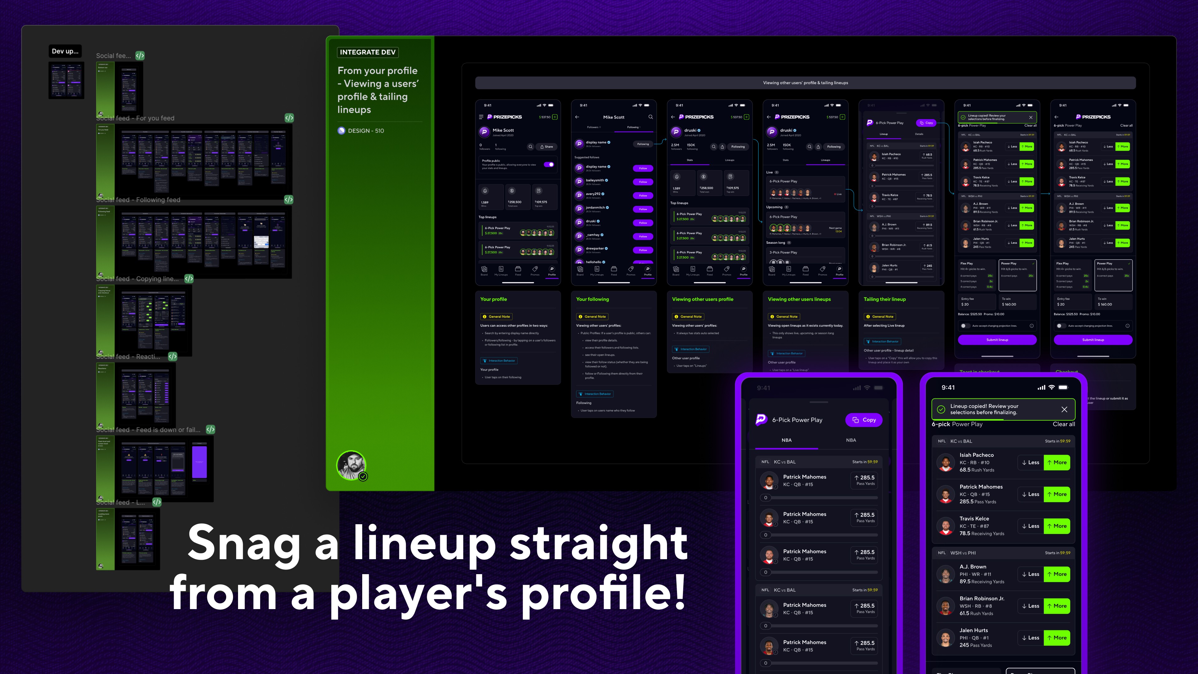
Seeing a friend's lineup is only valuable if you can ride with them. The signature UX breakthrough of this project was the One-Click Copy action. Instead of forcing users to manually search for individual player projections seen on their feed, we engineered a direct injection flow. Tapping "Copy Lineup" seamlessly populates those exact legs straight into the user's active Lineup Builder, reducing a multi-step search and add loop down to a single, low-friction tap.
5. Wireframing, Prototyping, and Validation
Before pushing anything to production, we ran a round of user experience research to stress test the design and gather early feedback. We wanted to ensure that introducing social elements wouldn't disrupt the high-intent flow of building an entry. The validation signal was overwhelmingly positive. Users immediately gravitated toward the community aspect, confirming that we were solving a real desire to share the game day sweat. The core functionality like player profiles and the copy flow resonated right away, leaving us with only minor feedback and optimization ideas for future iterations. This gave us the confidence we needed to move forward into full production.
6. Scalable Infrastructure and Collaboration
To ensure the ecosystem grew organically, we designed native out-of-app sharing loops. Users could generate dynamic, highly visual deep links of their profiles or active lineups to post across external social platforms, allowing them to brag about their stats or post receipts ahead of game time.